

8 BillionMinds
Redesigning a face to face learning platform
Challenge

How might we design a global learning platform that empowers people to seamlessly learn, share, and teach, while fostering a connected community that values curiosity and encourages meaningful human connections?
Timeline
Oct 2023-May 2024
My Role
I led the redesign of the learning platform for 8BM 2.0, focusing on improving user experience and engagement. Collaborating closely with the founder, I iterated on business goals and revenue streams while identifying user types and their journeys. I created wireframes, prototypes, and user flows to visualize and refine design solutions, ensuring the platform effectively met user needs and business objectives.

Understand

Context
8Billionminds is a global educational platform that aims to facilitate live, one-on-one learning sessions between people worldwide. By connecting people around the world to share, learn and teach each other, improve global education. The goal was to redesign the platform to enhance user retainment and encourage the sense of community.
Problem Statement
The original product successfully met its foundational goals at launch. However, over time and through user feedback, it became clear that the product had various issues such as user experience challenges, navigation difficulties, and a lack of a unified design language

User Problem
Users struggled with a disjointed experience that didn’t reflect how they naturally engage with learning and teaching.Learners couldn’t easily find relevant teachers, sharers lacked recognition and teachers found it hard to stand out or manage sessions, all contributing to drop-offs and low engagement.
Business Goal
To introduce monetization opportunities without compromising the platform’s core community values. The goal was to grow 8BillionMinds into a sustainable, scalable ecosystem where users could seamlessly move between learning, sharing and teaching, while still feeling part of an open and collaborative global network.

Research
Heuristics
We conducted a Heuristic Evaluation based on Nielsen's 10 Usability Heuristics to assess the client's existing website. We identified certain aspects of the site that failed the usability heuristic evaluation, and then included suggestions on how to fix these issues.

Understanding our Users

The 8BM Community has three sets of user flows:
Teachers: Teach as tutor
Learners : Learn from experts
Sharers : Learn and Teach for Free
From research, we realised that users are using the platform interchangeable.
Driven by curiosity, they want to explore diverse topics, learning from real people. This journey of self-guided learning naturally leads to seeking out expert teachers for deeper understanding. As they enjoy casually sharing their own knowledge with the community and over time, this passion may evolve into offering structured, paid teaching sessions. Their learning journey is not linear, it's a loop of learning, sharing and growing together.
Validate + Iterate
After several iterations, we tested the designs with a small group of users. Evolving the layouts, user flows we shipped these designs for our V2, its still evolving with our live user feedback and tracking the users patterns, with the goal to keep the platform community focused and a sense of belonging for users.
Design
Ideation
We started by asking ourselves: how do we balance approachability without overwhelming with details? Teachers are not just profiles—they are the core of the platform’s value. Users need to feel confident in their expertise while also seeing the human side of each educator. Likewise, subject cards had to convey structured information efficiently without overwhelming the user.
I began by sketching a few concepts of both teacher and subject cards. Each iteration focused on improving readability, consistency, and emotional engagement. I played with various layouts, experimenting with different elements such as:
-
Tags for quick information (like expertise level, subject category, and availability).
-
Photos and Names to add a personal touch.
-
Concise Bios that gave users a sense of who the teachers are, without feeling cluttered.

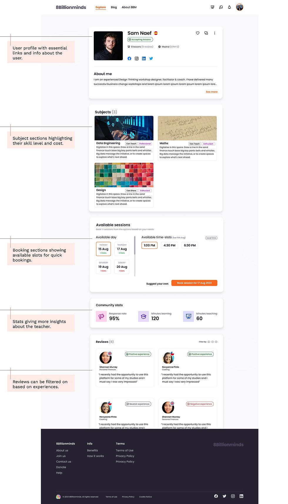
Profile
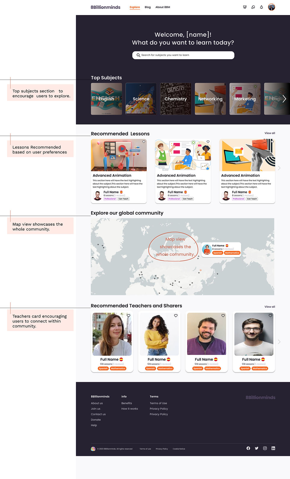
Explore
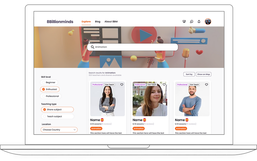
Search Results
Landing Page


Reflection and Next Steps
This project reminded me that designing for learning is ultimately about designing for connection. By listening to our users—whether teachers, sharers, or learners—I gained a deep understanding of their motivations and hesitations. What stood out most was how fluidly users moved between roles and how much they craved a sense of belonging, not just functionality. That insight drove every decision: from the structure of onboarding to the tone of interface copy.
After handing off the designs to the development team, I see these as our next steps:
-
Optimize community engagement features like peer reviews, badges and interest-based matching to deepen connections.
-
Implement adaptive onboarding that tailors flows based on user goals and role combinations (e.g., learn + teach).
-
Build dynamic content discovery paths using data-driven recommendations that feel curated, not generic.
After handing over the designs to developers, I see these as our next steps:
-
Collaborate with developers to integrate video consultation and real-time care availability.
-
Refine provider directory with better filtering and clearer vetting indicators.
-
Iterate on mental health tools with more personalized content and adaptive check-ins.
Impact
-
2.5× improvement in session bookings. Enhanced teacher discovery and streamlined booking flows made it easier for users to find and connect with teachers.
-
60% of users interacted with both roles. Redesigning the platform to support flexible role-switching (learner ↔ sharer/teacher) unlocked new patterns of engagement.
-
40% reduction in user drop-offs during onboarding
-
Positive qualitative feedback from users.Users reported that the new platform felt “more human,” “less transactional,” and “easier to explore and stay on.”
Research insights
By synthesizing user feedback, analyzing data, we acquired valuable information about the challenges users encountered. These are some of the prominent pain points that led to user drop-offs.
